Group
|
How was the use of camera shots?
|
Use of editing?
|
Use of lighting?
|
Overall success of video
|
| They have used a good variety of camera shots in their piece ensuring that they have covered all the necessary shots they needed. | their use of editing is good, i like how at the start they haven't got the video effect on but when the actual juno goes into the animation they have added the affect to make it look more true to life to the actual piece. | They have only used natural day light for their piece, which is appropriate for the task. | I think their version is good, however there are a few dodgy tracking shots and a bit of dodgy editing here and there, e.g. having a clip in the piece where the action dosent happen for the first few seconds. | |
Fixation Link

Peer evaluation of Juno
Juno Opening
Group- James B and Megan
What did you learn about filming and editing?
This was my first experience filming something like this so it was a steep learning curve for myself. I also learnt about using Adobe Premier, this included speeding up clips, shorting certain parts, different video transitions, shortening the audio track so that it fits in with the original as close as possible.
Did you find/use any premiere effects? If so, which ones and what was the effect?
Yes, we spent a lot of time tyring transitions to get it as close to the original as possible, the only effect we found was called 'push' which was used to transit to the foot scene. we also played around with the different video effects however no one of them produced the result we were looking for so decided to use the video how it was.
What went well in the filming and editing? How does it look compared with the original opening sequence?
Its very true to the original opening sequence, and looks pretty good, it is obiously missing the animated ascept of the original. the sound track fits the video well and starts at the same place as the orignail.
What could have gone better with the filming and editing?
Some of the camera work is a bit shaky, we also missed a scene out when filming and the end shot is from the back rather than the frount.

Oppositional and preffered readings
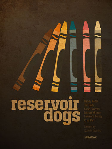
Preferred Reading:
This is a poster promoting the film reservoir dogs. is is about a group of people who are working together or there is one weak member of the group as the crayons are together but they are starting to fall over. this could represent how one members actions effect the rest of the group.
Oppositional reading:
Its a children's film or is aimed at a younger audience, this is shown through the use of the crayons on the poster.
Narrative
Resident Evil: After Life
Enigma Code:
- why is it raining?
- Why are we being shown these red shoes?
- Why are the Umbrellas all similar colours?
- why is the girl just standing there in the rain?
- Who is this girl?
- why are the people simply walking round her?
- who is the guy we are introduced to?
- why does she attach him? / bite his neck?
- Why are the lights going out?
Action Code
- the people walking
- eye contact with man, whats about to happen?
- Slow turn on the head, whats about to happen?
- girl throwing herself at him to attack him
- Mass Hysteria of people after attack
- fast camera pan upwards
Symbolic/Semiotic Code
- Rain, sadness, like crying
- Red Shoes, danger blood
- Stripy tights, set in her ways, looking for someone to attack / straight to the point
- Red Nail varnish, emphasis on danger
- Studs on hand bag, violence
- Red Umbrella, subtle danger notations
- Red umbrella in shot again, emphasis on danger
- Blue section on dress, linking with rain / tranquillity at the start
- Red Jacket, another danger notation
- Red umbrella in shot again, emphasis of danger again
- woman wearing red in background, danger hint
- In final pan up main colours of umbrellas are blue and red, linking to the colours that she is wearing, links the two parts of the opening sequence together (peaceful start with violent ending)
Poster Semiotics

The Film poster is divided into 4 different horizontal sections each with its own colour. the mains from the cast are all introduced in this poster and are almost paired up as they would be in the film itself. Also as the sections are on on top of the other so this could suggest a hiracry of people in the film. The use of the 3 colours here could represent how each on the character is going to be, e.g. Blue background for tranquil / calm characters with the characters in front of the red background could be the more aggressive / dangerous characters in the film.
in the Red background there is an outline of a Indian styled building. as this outline is in the red section of the poster it could represent how this location causes pain or is the site of pain in the film.
there is also evidence of a love story in the film were the couple are on the motorbike and the way she is holding on to him.
Horror For The Elderly
Horror for the elderly from Jbraddy
We were given the task of coming up with a movie with a horror genre for the elderly.
Above is our PowerPoint over viewing the film we came up with. We have tried to create a film with a horror aspect but with a slightly comedic edge as you don't really want your nan being scared out of her mind when she goes to see a movie. We used a mixed aged cast, most of them old but with a couple of younger cast members who get killed off. The movie is set in an OAP's home so the elderly audience have a location that they can relate to, this can make them laugh or could even make them scared as they imagine their own care homes contain a mass murder in the mist.
Our feed back was very positive, every member of the audience would have brought the film except from two. They like our opening, the use of a dark corridor and how we create a seance of mystery (more detail in PowerPoint) . They also liked our cast as they have all worked together well in previous films such as 'The Best Exotic Marigold Hotel" and "Quartet" and they thought it would be intresting to see how they react in this very different scenario.
Supernatural for Family Viewing


Genre: supernatural Audience: Family viewing
We tried to make our images as cheesy as possibile with a low gore asspect and steering away from the sterypoical vampires / zombies that usall apper under the supernatural category. Here we deminstrated 3 different types of camera angles, using an over the shoulder shot, different feild's of focus and a standard face to face shot.
Genre Analysis
DI: Wall E (2008) is an animation set in the not too distant or unrealistic future where the earth has become over run with rubbish and the fate of man kind is resting upon this small, knackered, adorable little robot which we are introduced to at the very beginning. The opening sequence starts out with some very vivid, detailed shots of space behind the Walt Disney Logo before panning down to a vivid contrast of a brown and dirty earth. Through out the opening sequence Michael Crawford's "put on your sunday clothes" plays out as we pass over various abandoned powerstaions and skyscrapers of rubbish. The use of this music foreshadows events happening later on in the film. The music then fades out before coming back in from a different source, it starts playing from Wall E himself as we are introduced to him fro the first time. This introduction of character also acts as the "Opening Title" as the name of the film is not formally introduced by typography but by a subtle name plate upon Wall E himself. We are then given a example of the work that he has being doing for rather a long time which gives the audience context into earlier on in the opening with the skyscrapers on rubbish. As Wall E moves past the camera stops moving and zooms in on a small cockroach for another character introduction before catching up with Wall E again where the two characters are shown the have a conection. Here we are also shown Wall E's curious side as he discovers, examines and collects a hubcap from the rubbish pile. We are finally shown Wall E turn off his cassette player signifying the end of the opening sequence.
Setting:
The movie is set in the not too distant future upon earth followed by on the large spaceship in which the human race has now relocated. however the opening sequence starts with shots of space before panning down to reveal earth and then take dive toward the surface where we remain for the rest of the opening.
Themes:
The opening highlights many different themes of the play, some very subtle and some not so much, some on the ones i picked up from the opening sequence were: Space and space exploration, Human environmental damage, the failing of renewable energy sources, the failing of recycling and waste disposal, survival and friendship.
Icons:
There are not many icons that jump out at you when watching the opening sequence, however there was the run down wind turbines, the cooling towers over run with rubbish, the towers of rubbish which were higher than the buildings, Wall E's Solar charge display and cassette playing features, the hubcap.
Narrative:
The story is told through the eyes of the audience. all the camera work is done as if the audience were the camera, flying past old satellites and over old power stations and piles of rubbish.
Characters.
The only Characters we are introduced to in the opening of this movie are Wall E and the Cockroach.
Subscribe to:
Comments (Atom)