
#1 In what ways does your media product use, develop or challenge forms and conventions of real media products ?

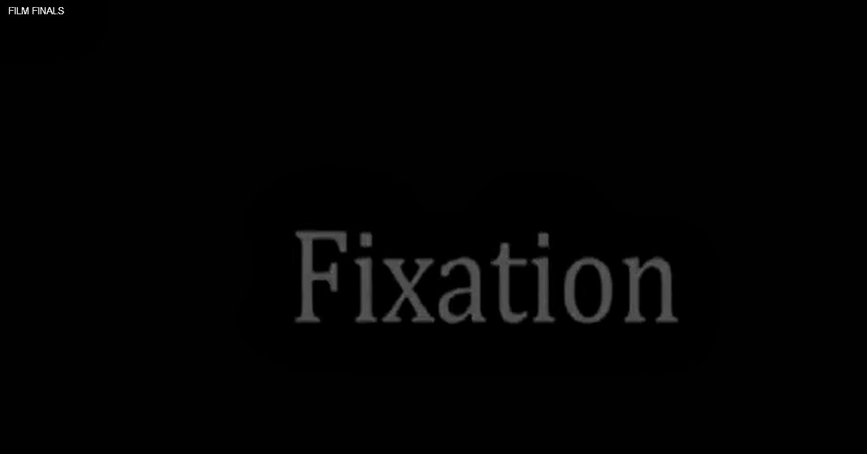
The first frame is for our main title Fixation. We decided to have our main title at point 1:46-1:47 as when it enters it separates the two characters personalities and shows that they are in different scenes living two different, separate lives. The music remains the same, to set the same feel throughout the scene. And although the music remains mysterious in the party scene, it is used to show the lurking from the stalker and show the audience she is present. The title flickers, which gives the dramatic effect from our opening, and this indicates the genre is thriller, along with the font.

The second frame which used conventions is of the location and setting. This is a over the shoulder shot of the stalker, Eileen, walking up the driveway. This suggests that James is a middle class boy as we have a clear shot of his house. It gives us a clear mind set of the type of protagonist James is going to be. In a film called 'truth or dare' there is a house party that is taking place. We used the idea of a house party too, as this attracts our target audience because that is the type of hobby's teenagers have nowadays.
 The third frame is to represent costumes.
This is also a shot of the stalker walking up the driveway as this is the only
long shot we include in our opening that gives us a view of what she is wearing.
She is wearing all black. Connotations of black are evil and gloom. She is also
wearing kitten heels, so she feels sexy within herself. She thinks that if she
looks sexy, James will go with her. This helps identify the personality of the
character Eileen. In the film 'Scream' the main character is always dressed in
all black, we got this inspiration from this as most scary protagonists dress in
all black clothing. This then gives away their image and a straight association
with all black is the evil character in the films.
The third frame is to represent costumes.
This is also a shot of the stalker walking up the driveway as this is the only
long shot we include in our opening that gives us a view of what she is wearing.
She is wearing all black. Connotations of black are evil and gloom. She is also
wearing kitten heels, so she feels sexy within herself. She thinks that if she
looks sexy, James will go with her. This helps identify the personality of the
character Eileen. In the film 'Scream' the main character is always dressed in
all black, we got this inspiration from this as most scary protagonists dress in
all black clothing. This then gives away their image and a straight association
with all black is the evil character in the films. The fourth frame is to show editing.
Throughout our editing, we include our titles within our opening scene to make
it more mysterious feel. As our genre is thriller, and our film is about a
stalker, we thought a stalker wall would easily show the personality of the
protagonist Eileen. We have used a 'ghosting' effect on Premiere, which consists
of layers over images which shows more than one shot at each time. This gives
the effect of the information on the board consistently entering Eileen's mind
and she is constantly reviewing her board on James and adding more
information.
The fourth frame is to show editing.
Throughout our editing, we include our titles within our opening scene to make
it more mysterious feel. As our genre is thriller, and our film is about a
stalker, we thought a stalker wall would easily show the personality of the
protagonist Eileen. We have used a 'ghosting' effect on Premiere, which consists
of layers over images which shows more than one shot at each time. This gives
the effect of the information on the board consistently entering Eileen's mind
and she is constantly reviewing her board on James and adding more
information.  The fifth frame is to show our font. The
font we chose is plane and simple but still gives the thriller vibe. We chose
this font because it does not give too much away, but at the same time gives
thriller hints that we thought were necessary. This pans over some of our
stalker board, which shows the audience the importance of this feature. In the
movie 'Signs;' all of the font that the titles are written in are Serif, and
this gives the horror feel as it almost looks old and spooky. This is where we
got our inspiration from and decided to duplicate this idea.
The fifth frame is to show our font. The
font we chose is plane and simple but still gives the thriller vibe. We chose
this font because it does not give too much away, but at the same time gives
thriller hints that we thought were necessary. This pans over some of our
stalker board, which shows the audience the importance of this feature. In the
movie 'Signs;' all of the font that the titles are written in are Serif, and
this gives the horror feel as it almost looks old and spooky. This is where we
got our inspiration from and decided to duplicate this idea.
The sixth frame is representing the story and how the opening sets it up. Here, is another over the shoulder shot of Eileen reviewing her information board on James. The board is very important in our movie, and it is an essential as without this the film would not make sense and would not give the stalker vibe we are specifically aiming for. This gives us a view of what she is seeing, and the layout the board is set in. It strongly shows Eileen's personality, and explains that she is obsessed with someone.
 The seventh frame shows the genre and how
the opening suggests it. I have given another shot of Eileen walking up the
driveway. The lighting shows that the setting is dark and gloomy, and this
clearly gives the interpretation that the setting is thriller. Also, the
clothing that she is wearing shows that she is a dark character and plays a evil
role.
The seventh frame shows the genre and how
the opening suggests it. I have given another shot of Eileen walking up the
driveway. The lighting shows that the setting is dark and gloomy, and this
clearly gives the interpretation that the setting is thriller. Also, the
clothing that she is wearing shows that she is a dark character and plays a evil
role. The eighth frame is how characters are
introduced. Our characters are introduced in different ways. Eileen is
introduced in a way of evil, as her gloomy lighting sets her personality
straight and indicates that she is the evil character in the film. In the
opening, we never see Eileens face, just like in the film 'Scream'. Throughout
the whole of the film scream, we never see the evil protagonists face, which
gives you the feel of barely knowing who the person under the mask is. This is
similar to the story we wanted to give off, as (only in the opening) we want to
remain Eileen to be mysterious, and this is why we never see her face. The next
character is James, and he is introduced in a way that he is shown at the party.
This is a stereotypical teenage boy, who drinks and attends parties and it gives
across that this will be the victim in the film.
The eighth frame is how characters are
introduced. Our characters are introduced in different ways. Eileen is
introduced in a way of evil, as her gloomy lighting sets her personality
straight and indicates that she is the evil character in the film. In the
opening, we never see Eileens face, just like in the film 'Scream'. Throughout
the whole of the film scream, we never see the evil protagonists face, which
gives you the feel of barely knowing who the person under the mask is. This is
similar to the story we wanted to give off, as (only in the opening) we want to
remain Eileen to be mysterious, and this is why we never see her face. The next
character is James, and he is introduced in a way that he is shown at the party.
This is a stereotypical teenage boy, who drinks and attends parties and it gives
across that this will be the victim in the film. The last
frame is special effects, and we have put a tweet over clips of the party scene.
This shows that this is the party that the tweet is talking about, and James has
announced to the whole of twitter that there is a party at his house and that
everyone is welcome. We have put the opacity to low, so that it does not stand
out too much and distract us from the scene in the background.
The last
frame is special effects, and we have put a tweet over clips of the party scene.
This shows that this is the party that the tweet is talking about, and James has
announced to the whole of twitter that there is a party at his house and that
everyone is welcome. We have put the opacity to low, so that it does not stand
out too much and distract us from the scene in the background.

Overall, I think
that our opening sequence is very successful. We do include some
challenges in our opening sequence and these include having a female villain,
not seeing the villains face and the party scene. Having a female villain was a
challenge for us, and a lot of market research took place before we decided to
use this thought. We noticed that in most thriller films, the evil protagonist
is mainly a male so we decided to oppose this idea to make it more original.
Next, we don't her face. This was also a challenge we portrayed but we thought
it would give more of a intense feel as. Next is the party scene, we had a big
challenge here. In most thriller films, the opening maintains as a scary vibe,
yet ours differs in a way that it includes something fun within to contradict
the two personalities. This then disorientates the audience as they will remain
confused.
A way in which we
support this is that we maintain the typical thriller conventions by keeping the
music eery, the lighting dark, the clothing bland and the setting spooky.
To develop our idea
we took our conventions and put the titles into our map. We then went further as
we included them in our scene instead of putting them over after on editing