Fixation Link


Opening Timeline
Titles:
56 – 1.00 Min – Natasha Bishop
1.01-1.04 Min – James Braddy
1.08-1.12 Min – A Film By
1.14-1.16 Min – Rebecca Stanway
1.19-1.21 Min – Written By
1.26-1.29 Min - Charlotte Gregory
1.33-1.36 Min -Lara Eardley
1.45-1.48 Min – Fixation
Sound:
0-1.13 –Dark Scary Supence music Instrumental
1.00-1.00 Min – Radio static
1.04-1.05 Min – Radio static
1.18-1.19 Min – Radio static
1.35-1.36 Min – Radio static
1.42-1.44 Min – Radio static
1.45-1.48 Min – Radio static
Footage:
0-24 Seconds - Fox Searchlight Pictures
24-28 Seconds – Scorpion Productions
28-43 Seconds – Map Stroke
43-52 Seconds- String Stick
53-1.42 – titles Panning with ghosting
1.00 – 1.00 Min – House Approach Snapshot
1.04-1.05 Min – 2nd
house approach snapshot
1.18-1.19 Min – 3rd house Approach
1.35-1.36 Min – 4th House Approach Shot
1.42-1.44 Min – 5th house approach shot
1.47-1.56 Min – Party Scene strobe lighting with tweet
overlay
1.56-1.59 Min - Knock on the door
Orignail Film Pitch Updated version
Here is the next version of the original film pitch , this is our finial idea and what we will work with for our final piece.


More Poster Feedback
Today we asked one of our media teachers (Mrs Field) what they thought of our posters for the film. we showed her all 5 of our 2nd drafts and changes from feedback.


We then asked her for her top 3 and she chose poster 2, 3 and 4 with her favourite one being 2.
Overall she said that the genre was easy to get across and that the fonts were great and easy to read. the posters were better without colour overall.

1
We showed her this one and she said that she really liked the font used for the credits and titles but the picture she thought was to comical to fit in with the genre if it was meant to fit with a true to life style.
2
Miss really liked the idea behind this poster, how you cant really tell who the victim is and how you still got the same information that you get from the first. we then asked her for improvements and she said that possibly we should retake the picture of our woman actor and get her to match the casual / vacant pose that i am making. 
3
we then showed her this poster and she liked how it was portrait from the landscape posters and she liked the 'E-Fit' type of image we were tyring to replicate. she did say that our segments were too far apart and too exaggerate. It was good that she got the E-Fit idea as it means that it gives a clear image / the message is easy to get from the poster.
4
Following on from other feedback we had received we had changed the image on the first poster and then asked for her opinion on this poster. she again liked the 'E-Fit' image but said that now the two E-Fit posters were too similar so suggested that we should just have an 'E-Fit' face on this poster instead. This is an idea we will be tyring out at a later date as we will need to soot this image on a better camera so we can blow the picture up bigger with out blurring and pixalation.
5
after that we showed her our colour version of the previous and she didn't like the use of colour on the poster, she said that red was too stereotypical and we should just stick with the black and white versions.We then asked her for her top 3 and she chose poster 2, 3 and 4 with her favourite one being 2.
Overall she said that the genre was easy to get across and that the fonts were great and easy to read. the posters were better without colour overall.
Feedback, Now With Colour!

Early Feedback Responce to Poster 1

Some of the early feed back we got was that the first poster's picture was to comical or not serious enough for the film, so we have changed it by taking the image from poster 3 and moved it onto poster 1 as much of a replica as we could manage.
2nd Draft Posters


Here are the 2nd drafts of the posters, we have added more imformation to the posters using a font commonly found on movie posters as well as including dates on all the posters.
Synopsis Planning
Synopsis Planning
We will open with a shot of a ‘Stalker Wall’ covered in
pictures stuck around a map, there will be red string stuck into the board with
pins. We aim to have a shot of the stalker putting a pin into the board which
we will film this close up to the wall on the angle so we see the pin get
pushed into the board. We will then see the Stalkiee send a tweet about his
party, then a sudden cut to the stalker’s laptop where the tweet comes up and
she grabs her car keys. We are then back at the boy’s house, he’s putting on
his birthday badge and we are looking through the window at the party in action
he’s drinking; this shot is from the eyes of the stalker. We are then outside
and people are leaving, we watch feet move past the camera as the stalkers feet
come out of the shadows and head towards the house. The door opens, we then cut outside where we
see the badge drop on the ground, the sound of car doors slamming and we watch
the car drive away. Fade to black. We
are now in an off-licence, our stalkiee is buying alcohol when he gets a text
through on his phone, its about his party tonight.
The rest of the film will be about how the stalker is
following him online and in person, how she plans her every move and is waiting
for her moment to strike. Later on in the film we see the kidnapping in more
detail and where he ends up. At the end of the film we would want the audience
to feel sorry for the stalker as her obsession over our stalkiee is only
through the tragic loss of her own son and her husband divorcing her. The audience will only find this out about ¾
‘s of the way through the film.
Poster 1st Drafts


These are the very first poster ideas / drafts that we have done for our opening, "Fixation"

AS Film Opening Examples
Here is another good example of an opening. i particularly like the point of view shots as we walk down the corridor and each one of the pictures coma alive. the projection of the wedding video is a nice scene. The use of voice over is also really effective in this piece it gives the audience a really good insight of the main character, however im not really sure where this piece would lead on to, we seem to have a pretty good overview of their relationship from start to end in the opening so i could see the continuity of the overall film becoming a bit dodgy. apart from that i really like the overall effect of the piece giving the whole opening a really creepy and mysterious feel to it, 50 out of 60
I really liked this film opening theres a really great mix of diegetic and non diegetic sound used throughout. There is also a good mix of matching action shots where he's picking up his lunch / walking through doorways etc. the overall opening fits the genre of romance really well, its further aided by the use of the high piano notes laid over the action when it slows down, which is another thing they did very well with was matching the pace of the music to the pace of the action which gives it a more polished and professional look. the ending of the sequence is very good as well where they leave it on a cliff hanger / good transition to the rest of the film. however there are a few dodgy shots in the opening, where he is looking through the tube window looks like he's a little bit perverted / strange. but over all i would give this opening a 54 out of 60.
Cassino Royale Titles

T1: "Daniel Craig"

T2: "as Ian Flemmings James Bond 007"

T3: "Casino Royale"
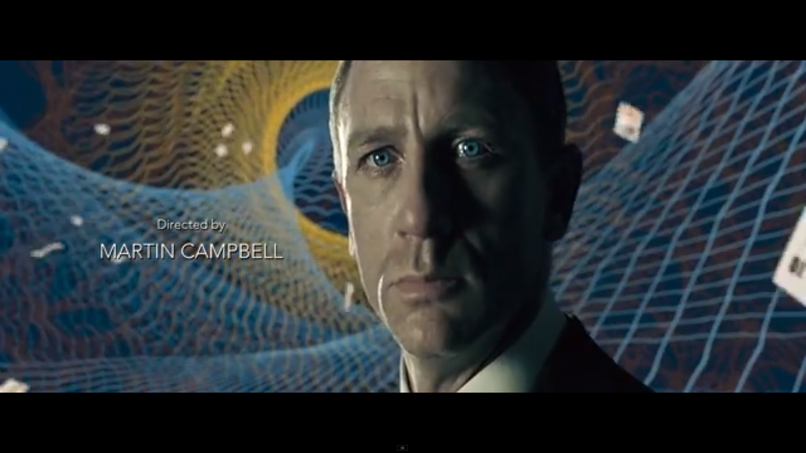
T4: "Directed by Martin Campbell"

T5: "Albert R. Broccous Eon Productions Ltd.

T6: "Staring Eva Green"

T7:"Mads Mikkelsen"

T8: "Giancarlo Gianni"

T9: "Caterina Murino, Simon Abkarian, Isaach De Bankole"

T10: Jesper Christensen, Ivana Milcevic

T11:"Tobias Menzies, Claudio Santamaria, Free running stunts by: Sebastien Foucan"

T12:"With Jeffery Wright"

T13:" and Judi Dench as M"

T14:"Associate Producer Andrew Noakes Production Executive David Pope"

T15:"Camera Operator Rodger Pearce, Second Unit Director Terry Madden, Script Supervisor Jean Bourne, Publicity and marketing Annie Bennett, promotions Keith Snelgrove, Assistant Producer David G Wilson"

T16:" Sound recordist Chris Munro, Electrical Supervisor Eddie Knight, Stills Photographer Jay Maidment, Paul Engelen, Hairdressing supervisor Christine Blundell, Wardrobe Supervisor Dan Grace"

T17: Visual Effects and Maitance Supervisor Steve Begg, Supervising Art Director Simon Lamont, Propety Manager Ty Teiger, Construction Manager Stephen Bohan, Post production supervisor Michael Solinger"

T18:"Unit Production Manager Jeremy Johns, Second unit Production Manager Terry Bamber, First Assistant Director Bruce Moriarty"

T19: "Casting Debbie McWilliams, Stunt Coordinator Gary Powell"

T20: "Specail Effects and Minature effects supivisor, Chris Corbould, Main Title Designed by Daneil kleinman"

T21:"Second Unit Director Alexander Witt"

T22:"Costume Designer Lindy Hemming"

T23:"Editor Stuart Baird"

T24:"Director of photography Phil Meheux"

T25:"Production Designer Peter Lamont"

T26:"Music by David Arnold"

T27:"'You know my name' Performed by Chris Cornell written and produced by Chris Cornell and David Arnold"

T28:"Executive producers Anthony Waye Callum McDougall"

T29:"Based on the novel by Ian Fleming"

T30:"Screenplay by Neal Purvis & Robert Wade and Paul Haggis"

T31:"Produced by Michael G Wilson and Barbara Broccoli"
**Corections as Blogger messed up when importing: T5 should be T1 and T4 should be T31 but they will be described using the numbers under each screen shot.**
Throughout the title sequence the same clean crisp typography is used even for the main title of the film. this is layered over the top of some casino themed animations, some good example of this is in T19 and T20 where there are shaped reminiscent of veins which have broken open and red hearts are flowing out of them representing blood. the theme of gambling is seen in ever shot from T6 to T26 using the correlating background patterns representing casino tables. Towards the end of the opening (T27 onwards) the background rapidly changes into these swirling patterns which is similar to the kind of pattern you might find on a bank note which again reenforces the casino themes.
Subscribe to:
Posts (Atom)